Wednesday, April 29, 2009

Almost Everything


My personal logo.


Poster relating to the Iraq War for an imaginary rally.


Book Cover for Lester Beall. For this assignment we had to design a book cover that was "inspired by" a famous graphic designer. I might make an inspiration board to show what I was going for, but I think it looks cool even if you haven't seen his poster series'


Candle Packaging. The goal of this assignment was to pick something out of a hardware store, and redesign the packaging. The hard part was to make it have appealing design, but still give off a "hardware packaging" vibe (and most hardware packaging is NOT that pretty)


Earthday Poster.


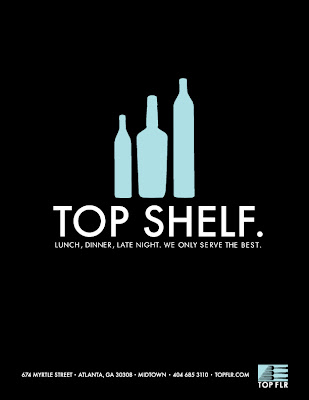
The rest of this is Top Flr stuff. At the very end there is a webpage design that I've been working on, tell me what you think.


This is a mockup of a website for Top Flr. Any suggestions?

I really didn't care for the stuff I did in my Typography class with Jeff,
so I might try to steal some of Paige's assignments from her Typography class' blog.
I'll come up with SOMETHING cool either way.

Any comments/suggestions on any of these? PLEASE lol

Sunday, April 26, 2009

Matchbooks


An alternate color scheme I'm thinking about doing.

Final Ads!


My final ads!

Cool Stuff


New stuff from Steven Harrington -- http://www.stevenharrington.com/

Google Maps Alphabet


I thought this was pretty cool, finding an alphabet on Google maps.
This was done by a graphic designer/art director named Rhett Dashwood,
check out his site, it's pretty cool. http://rhettdashwood.com.au/

Wednesday, April 22, 2009

Earth Day Poster


My Earth Day poster, a little late. What do you guys think, any suggestions?

Thursday, April 9, 2009

GSU juried show


So on thursday when the submissions were due for the juried GSU art show, i was in the computer lab i was emailing them, and I was sitting next to sarah kim, and she was like, "you know the deadline to email your stuff its at 5 pm, right? And i was like oh crap, because it was 5:30. So I emailed these in at 5:30, hoping they would still take them, but I didn't get an email back! But oh well. Anyway I thought I'd share what i attempted to submit, haha

the first one is a picture of Michael Alig and DJ Keoki from the 80's, that I pulled a "Shepard Fairey" on. The second one is from one of my own photos of my friend Saam. Did these mostly with the pen tool.

Thursday, April 2, 2009

Ads


What do you guys think about these? Can you tell what all of the objects are in the second one? Does the sizing look alright, think anything would look better if it was smaller or bigger?

Thursday, March 26, 2009

Ad idea


This is my ad idea, I think I'm gonna use this as a theme. I'll post the updated version in a lil while.

Sunday, March 15, 2009

Final letterhead ideas


So the letterhead had me kind of stuck, I'm not sure why. I'm feeling better though with these, I think they're more playful and play off my logo more. I also wanted to have it cleaner looking like my business card, because I really like my simple business card. I still think I'm going to have my wallpaper pattern on the back, to make it look nice when it's folded up.

Thursday, March 12, 2009

stationary


What do you think about these?
I like the white background letterhead. are these too boring?

Wednesday, February 25, 2009

Stationary, give me comments!


This is a first page and a second page, I really like these. I decided to stick the letter inside a little house or arrow, going for that "top floor" imagery.


Another simpler version


Nooooo, I don't think so.


Started with the most obvious, just to get it out of my head.

Lemme know if you have any ideas that could help me.

business cards


These are just some preliminary ideas for some business cards, still developing these.

Tuesday, February 17, 2009

ZEVS


Zevs is a french graffiti artist that I came across awhile back in Interview magazine. He's doing really cool stuff with famous logos, making them all drippy and gruesome looking! His website is also really interesting, and it's based on google's layout, it's definitely worth looking at.


Fail Blog


These are a few funny type-related images I bulled from Fail Blog. I'm sure many of you have seen it before, but If not, you should really check it out. It's a bunch of hilarious images of really silly things, and whenever something doesn't make sense, they stamp "FAIL" on it.